
I’ve been bullet journaling for several years now and have blogged about my practice a couple times. But I’ve never discussed my materials, because really, all you need to start a bullet journal is a notebook and a writing utensil. (This is probably a good time to mention that if you aren’t familiar with the Bullet Journal method, the rest of this post probably won’t make much sense to you. But I encourage you to check it out, if you’re interested!)
When (Bullet Journal creator) Ryder Carroll unveiled the official Bullet Journal Edition 2 late last year, I knew I had to try it. I managed to snag a blush pink notebook and I’ve been using it for a little over a month now.
This notebook is currently sold out, but it’s set to restock soon, so I hope this review is helpful to anyone thinking about buying it!
In the past, I’ve used the regular Leuchtturm1917 A5 dot grid notebook as my bullet journal, so that’s my point of reference. The official Bullet Journal is a modification of this style.
Below, I’ll break down the features of the official Bullet Journal and how I feel about them (“Good,” “Meh,” or “Bad”), comparing them to the regular Leuchtturm A5 if relevant. Note: These ratings are just my opinion, shared to hopefully give you some insight into whether you might like this notebook. What I see as a not-so-great feature might be a plus for you!
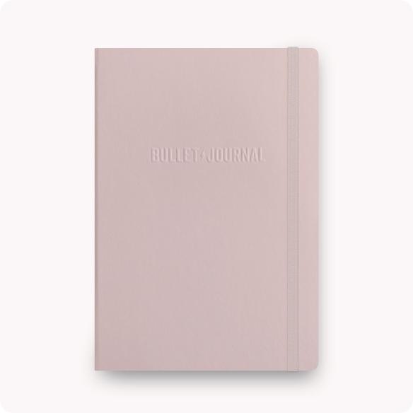
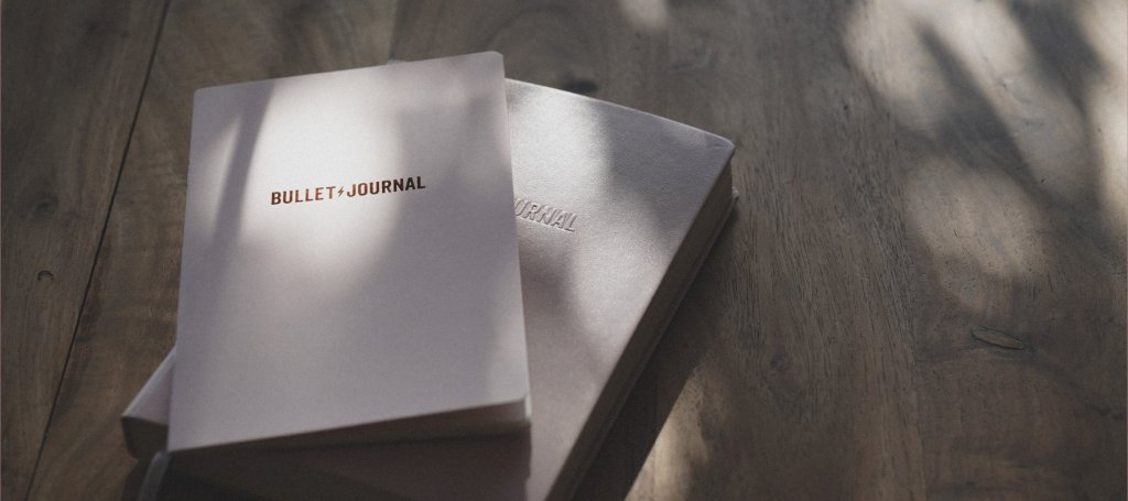
Bullet Journal branding: Good
I love the simply embossed “BULLET JOURNAL” on the cover of this notebook. It’s subtle enough to avoid drawing attention to itself, but present enough to remind me of the meaning behind this practice each time I open my notebook. The paper jacket that explains the new features is well-designed, and it’s clear a lot of care went into this presentation.

Grid Guide: Meh
I love the idea of a grid guide—basically, a “cheat sheet” page that marks where to separate a page into halves, thirds, quarters, et cetera—but I don’t feel like it does much stuck inside the front cover. I’d much rather have a removable grid guide on a transparent sheet that I can lay over any page of my notebook to quickly divide it up into rows or columns. In fact, I might make something like that for myself.

Key, Intentions, Index, and Future Log: Meh
I believe these are features of the Bullet Journal Edition 1, too, and I imagine they’re helpful for anyone starting out. Personally, I don’t need a key, and I usually use only two pages for each my Index and Future Log (which are each allocated 4 pages in this notebook), so I’m not sure if I will be taking full advantage of these pages. I did appreciate the dedicated space for intentions, though, and I will carry that practice forward with me.
Smart Grid: Good
This is one of my favorite features in Edition 2. Subtle dots at the inner and bottom edge of each page’s grid allow you to quickly divide a page into halves or thirds (or quarters, or sixths…). It’s drastically cut down on my time spent counting dots and is intuitive to use once I identified the extra dots. The Smart Grid might be the single most compelling reason to choose this notebook over another one, in my opinion.

Page Status bullet: Good
I am still figuring out how I want to use this feature, but I love the idea of a single bullet that you can use to determine, at a glance, whether a page requires your attention in the moment or what it’s for. Although I don’t do my Daily Reflection/Monthly Migration exactly like the original Bullet Journal method, I’ve still found it useful to X out this bullet on my Daily Log pages when I’ve completed all my tasks. For my other Collections, I want to color-code this bullet somehow, I just haven’t nailed down my system yet. Also, the page numbers are now centered above this bullet, which is a nice touch.
Larger Margins: Meh
This isn’t a bad feature, it just doesn’t make much difference to me. I tend to write from the top to the bottom of the page without much regard for the margins, anyway. It does mean there are two fewer squares in the grid in each vertical and horizontal direction, if that matters to you.
Lighter Dots: Bad
Alas, the only bad feature of the Bullet Journal Edition 2, in my opinion! The dots in this notebook are significantly lighter than those in the regular Leuchtturm A5. In bright light, it’s not too much of an issue. But in low-light conditions I really struggle to see the dots, and then they’re not really serving their purpose as a guide for writing neatly or drawing straight lines. I imagine the intention of this change was to make the dots less prominent under drawings and other artistic creations, but since I primarily write and create simple collections in my journal, I’d much rather the dots stand out than fade into the background.
120 GSM paper (and fewer pages): Meh
I’m torn on this feature. One one hand, the thicker pages in Edition 2—120 GSM (grams per square meter, a measure of paper weight) as opposed to 80 GSM in a regular Leuchtturm—feel very nice, and I do notice less ghosting (writing visible through the back side of a page), although that never bothered me much in the first place. The tradeoff, though, is that there are only 204 numbered pages in this journal, a significant decrease from 251 pages in a standard Leuchtturm notebook.
I imagine the thicker pages were added to appeal more to the artistic bullet journalers who use heavier inks and paints in their notebooks, but most of that community (in my experience) prefers even thicker 160 GSM pages. And for me, someone who’s just writing in my journal 95% of the time, I’d rather have more, thinner pages than fewer, thicker pages.
One more good thing, though: This new paper is “sustainably sourced.” I don’t know exactly what is meant by that, but if it’s true then I’m glad to hear it.
Three Bookmark Ribbons: Good
Before I got this notebook, I didn’t think having three built-in bookmarks instead of two would drastically alter my bullet journaling practice, but it’s actually been great. I use one bookmark for my Monthly Log and one for my Daily Log, as before, but now I have an extra one for whichever other spread I want to quickly reference. Sometimes this is a weekly log, or it’s another collection I update often, like the books I’m reading. (This is also a feature of Edition 1, but not of the regular Leuchtturm notebook.)

Sticker Sheet: Good
Now, this is a feature that fits perfectly with the Bullet Journal ethos. If you use the original vertical Monthly Log layout like me, the rose gold-printed stickers with dates and days of the week are the perfect time-saving efficiency—and they look lovely, too. Ditto for the names of each month, though I use those a bit differently than originally intended. I haven’t much used the lightning bolt and bullet icon stickers yet, but I’m excited to incorporate them.
Pocket Guide: Good
Edition 2 comes with a removeable booklet in the back cover laying out the basics of the Bullet Journal Method. I’ve been bullet journaling for a few years, so I don’t need to read it, but I think it’s a great introduction for any new journaler without taking up precious page space for anyone who doesn’t need it.
Summary
Here are the features I rated as Good, Bad, and Meh:
Good
BuJo branding
Smart Grid
Page Status bullet
three bookmarks
sticker sheet
Pocket Guide
Meh
Grid Guide
Key, Index, etc.
larger margins
120 GSM paper / fewer pages
Bad
lighter dots
Overall, I’ve enjoyed using my Bullet Journal Edition 2 for a fresh start to the new year. Right now, the good features (especially the Smart Grid and stickers) outweigh the meh/bad (those pale dots!!) for me, so I’ll probably keep using this notebook unless I find another one that better suits me needs.
This is purely speculative, but I feel like some of these changes—especially the thicker pages, Grid Guide, and lighter dots—are designed to appeal to the more artistic members of the Bullet Journal community, while still retaining the system’s simple utility (page numbers, and dedicated pages for some core elements of the method) that attracts its more minimalist users. To me, it seems like splitting the difference. As I mentioned above, I think artsier BuJo-ers will still gravitate toward notebooks without page numbers and with even heavier pages, while those who tend toward a simpler style, like me, would appreciate having more pages instead of thicker ones. So if more changes are in the pipeline for a future Edition 3, I’d love to combine some of the excellent features of this edition, like the Smart Grid, with the classic specs of the blueprint.
I hope this review was helpful in determining if the Bullet Journal Edition 2 is a good choice for you! If you have thoughts of your own about this notebook, I’d love to hear them.

Thank you for writing this review. Really helpful.
LikeLike
You’re welcome! I’m glad it was helpful. 🙂
LikeLike